Introducing MUI Base: the headless alternative to Material UI
While Material UI is excellent for building sleek user interfaces that adhere closely to Material Design, it can become unwieldy when your design system diverges significantly from the defaults. We get it. We've all been there.
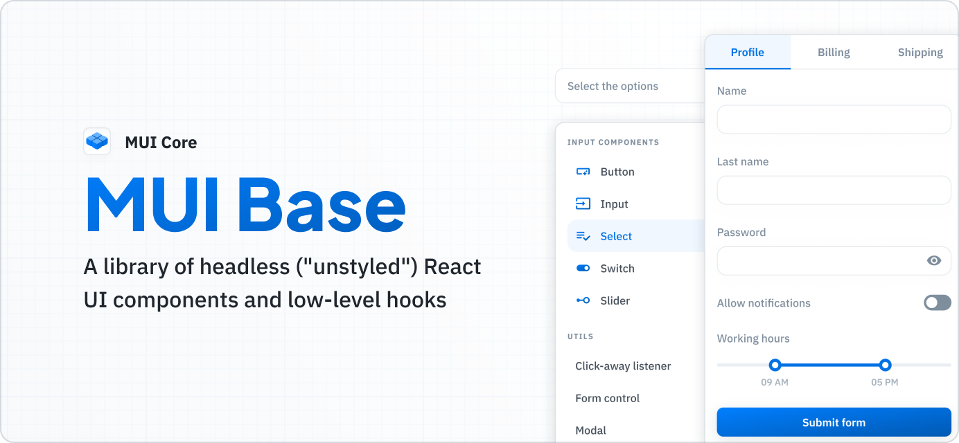
That's why we're building an entirely new library of headless React UI components and hooks called MUI Base—to give you complete control over the look and feel of your user interface, with no defaults to override.
MUI Base is easy to pick up if you're already familiar with Material UI, as the APIs are very similar—indeed, they were designed to be complementary to one another. Start from scratch with MUI Base, or use Material UI for rapid prototyping, and then switch to MUI Base when you need more customization options.
Why MUI Base?
MUI Base was created to serve a different set of needs than those addressed by Material UI. Material UI shines at providing you with the means to quickly create user interfaces that look close to the Material Design specification. MUI Base, on the other hand, prioritizes customizability over the speed of development. This makes it better suited for public-facing projects where pixel-perfect implementation is crucial.
So, why not use any of the headless libraries already present on the market instead? There are other alternatives like Headless UI, Radix UI, and React Aria, to name a few. MUI Base's significant advantage is that it takes the best parts from Material UI, which is a complete, mature library. It is free from many of the issues that have been reported and fixed in Material UI. Also, many of the improvements to Material UI proposed by the community over the years are included in MUI Base.
While they were created for different use cases, these two libraries share many common features and design patterns, and are intended to be complementary to one another within the MUI ecosystem. MUI Base's API will be familiar to you if you've used Material UI before, making it easy to migrate a project—or just a part of it—from one library to the other if needed. We aim to create unstyled versions of all Material UI components (that make sense to do so).
Components and hooks
MUI Base offers two kinds of building blocks: unstyled components and hooks.
Components are more straightforward to use of the two. Place a component on a page, add your own styles, and it's ready to go! It's important to note that you are not limited to the styling options available in Material UI. You can, of course, still use MUI System, but if you prefer Emotion, Tailwind CSS, plain CSS, or any other styling engine, they are available too! Check out the Working with Tailwind CSS guide for an example of using this library.
In contrast to Material UI, MUI Base's components do not have any default styles. They provide functionality and structure, while designers and developers are responsible for the visuals.
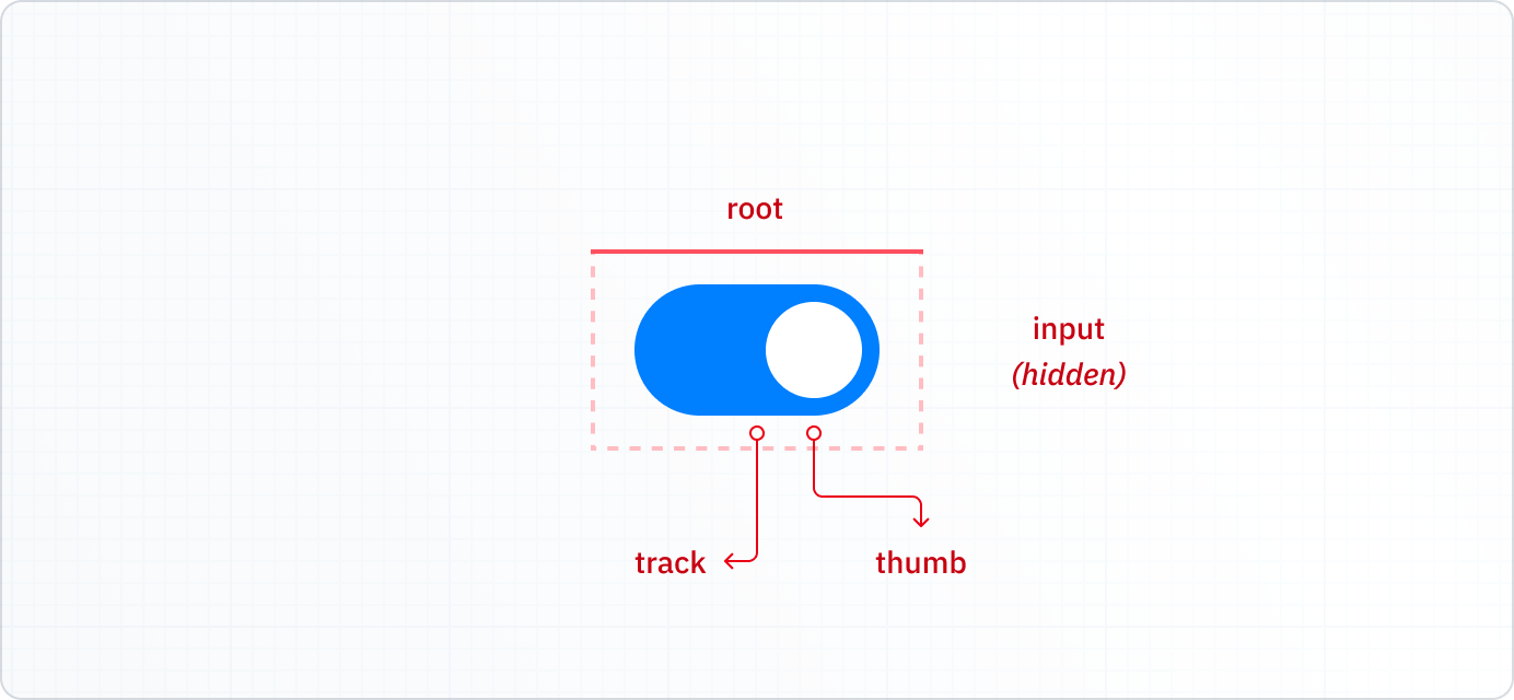
Each unstyled component lets you modify or override its _slots_—smaller subcomponents representing the interior elements that comprise the component's DOM structure.
For example, a SwitchUnstyled contains the root, thumb, input, and track slots.
You can control props passed to each of these slots (including className) based on the component's state, and even replace the default slot components with your own.

See how it works on the live demo:
Hooks take this one step further by extracting the logic from the structure entirely, so you can build from scratch using any DOM elements you need. This requires more work to implement but gives you the most freedom to customize.
Upon calling, a hook returns an object describing the component's state (i.e., whether the switch is turned on), along with methods that apply accessibility props and event handlers. You should spread these props on the components you've defined, as shown below:
function MySwitch(props: UseSwitchParameters) {
  const { getInputProps, checked, disabled } = useSwitch(props);

  return (
    <span className={clsx('root', { checked, disabled })}>
      <span className="thumb" />
      <input className="input" {...getInputProps()} />
    </span>
  );
}
What's included
The initial version of the library contains 17 components. Check out the MUI Base documentation for details.
You can track our progress in adding new components—and comment to influence our priorities—in this dedicated GitHub issue.
The @mui/base package is released as an alpha. This means the component APIs are subject to change—especially as we receive feedback from the community about room for improvement. However, we believe the library is solid enough at this point to start building design systems with it. In fact, we're using MUI Base to create Joy UI—the next product we'll be launching in our line of Core component libraries that also includes Material UI. In the future, MUI Base will also be used as the foundation for Material UI components to provide a consistent developer experience across our entire suite of products.
Feedback needed
Give MUI Base a try today by installing the package via npm:
npm install @mui/base
or yarn:
yarn add @mui/base
Check out the docs, play with the components, and be sure to let us know what you think!
If you find any bugs or want to share ideas for improvements, please don't hesitate to open an issue in the MUI Core repository on GitHub. Be sure to include "[base]" in the issue title to help us keep things organized.
Happy creating!
