Working with Tailwind CSS
Learn how to style MUI Base components with Tailwind CSS.
Getting started
The goal of this guide is to teach you how to style MUI Base components using Tailwind CSS while building an interactive and accessible app.
Prerequisites
This guide assumes that you have a basic working knowledge of the following:
- Tailwind CSS
- TypeScript in React
- building React UI components
We will not be covering these topics in detail here.
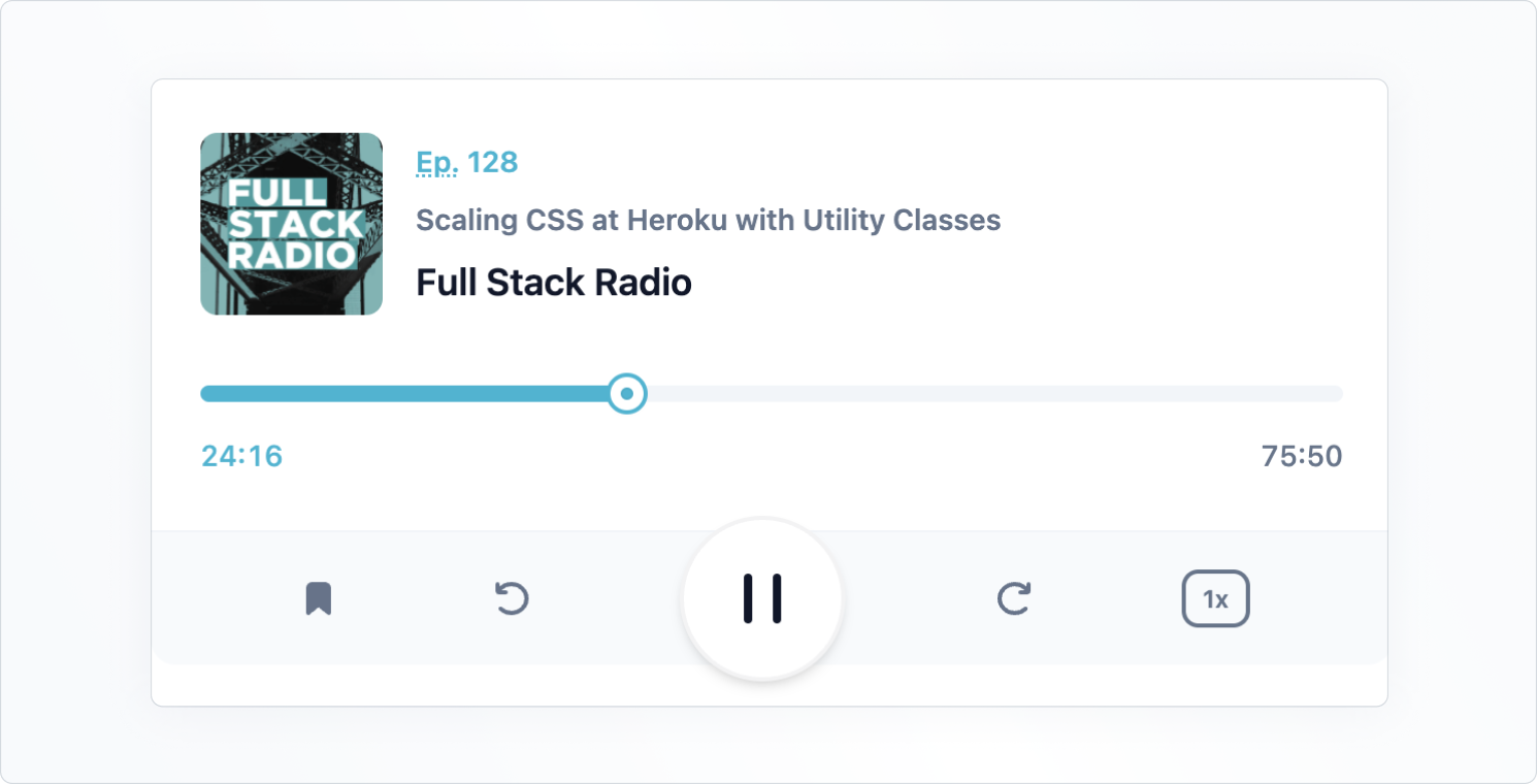
The end result of this guide is an interactive media player interface. Here's what it will look like in the end:
Setting up the project
We'll use create-react-app with typescript for this guide.
After you have created the project, follow the instructions given on the Tailwind CSS installation page in order to configure tailwind.
Next, install @mui/base in the project:
npm install @mui/base
Adding the player markup
Now, create a file called Player.tsx and add the markup below, which includes Tailwind CSS classes:
Player.tsx
import * as React from 'react';

const Player = React.forwardRef(function Player(
  props: { className?: string },
  ref: React.ForwardedRef<HTMLDivElement>,
) {
  const { className = '', ...other } = props;
  return (
    <div
      className={`max-w-[600px] max-h-[240px] m-auto ${className}`}
      {...other}
      ref={ref}
    >
      <div className="bg-white border-slate-100 dark:bg-slate-800 dark:border-slate-500 border-b rounded-t-xl p-4 pb-6 sm:p-10 sm:pb-8 lg:p-6 xl:p-10 xl:pb-8 space-y-6 sm:space-y-8 lg:space-y-6 xl:space-y-8">
        <div className="flex items-center space-x-4">
          <img
            src="https://tailwindcss.com/_next/static/media/full-stack-radio.485d0b2c6e3aa1cacc6b50e462cd3675.png"
            alt=""
            width="88"
            height="88"
            className="flex-none rounded-lg bg-slate-100"
            loading="lazy"
          />
          <div className="min-w-0 flex-auto space-y-1 font-semibold">
            <p className="text-cyan-500 dark:text-cyan-400 text-sm leading-6">
              <abbr title="Episode">Ep.</abbr> 128
            </p>
            <h2 className="text-slate-500 dark:text-slate-400 text-sm leading-6 truncate">
              Scaling CSS at Heroku with Utility Classes
            </h2>
            <p className="text-slate-900 dark:text-slate-50 text-lg">
              Full Stack Radio
            </p>
          </div>
        </div>
        <div className="space-y-2">
          <div className="relative">
            <div className="bg-slate-100 dark:bg-slate-700 rounded-full overflow-hidden">
              <div
                className="bg-cyan-500 dark:bg-cyan-400 w-1/2 h-2"
                role="progressbar"
                aria-label="music progress"
                aria-valuenow={1456}
                aria-valuemin={0}
                aria-valuemax={4550}
              ></div>
            </div>
            <div className="ring-cyan-500 dark:ring-cyan-400 ring-2 absolute left-1/2 top-1/2 w-4 h-4 -mt-2 -ml-2 flex items-center justify-center bg-white rounded-full shadow">
              <div className="w-1.5 h-1.5 bg-cyan-500 dark:bg-cyan-400 rounded-full ring-1 ring-inset ring-slate-900/5"></div>
            </div>
          </div>
          <div className="flex justify-between text-sm leading-6 font-medium tabular-nums">
            <div className="text-cyan-500 dark:text-slate-100">24:16</div>
            <div className="text-slate-500 dark:text-slate-400">75:50</div>
          </div>
        </div>
      </div>
      <div className="bg-slate-50 text-slate-500 dark:bg-slate-600 dark:text-slate-200 rounded-b-xl flex items-center">
        <div className="flex-auto flex items-center justify-evenly">
          <button type="button" aria-label="Add to favorites">
            <svg width="24" height="24">
              <path
                d="M7 6.931C7 5.865 7.853 5 8.905 5h6.19C16.147 5 17 5.865 17 6.931V19l-5-4-5 4V6.931Z"
                fill="currentColor"
                stroke="currentColor"
                strokeWidth="2"
                strokeLinecap="round"
                strokeLinejoin="round"
              />
            </svg>
          </button>
          <button
            type="button"
            className="hidden sm:block lg:hidden xl:block"
            aria-label="Previous"
          >
            <svg width="24" height="24" fill="none">
              <path
                d="m10 12 8-6v12l-8-6Z"
                fill="currentColor"
                stroke="currentColor"
                strokeWidth="2"
                strokeLinecap="round"
                strokeLinejoin="round"
              />
              <path
                d="M6 6v12"
                stroke="currentColor"
                strokeWidth="2"
                strokeLinecap="round"
                strokeLinejoin="round"
              />
            </svg>
          </button>
          <button type="button" aria-label="Rewind 10 seconds">
            <svg width="24" height="24" fill="none">
              <path
                d="M6.492 16.95c2.861 2.733 7.5 2.733 10.362 0 2.861-2.734 2.861-7.166 0-9.9-2.862-2.733-7.501-2.733-10.362 0A7.096 7.096 0 0 0 5.5 8.226"
                stroke="currentColor"
                strokeWidth="2"
                strokeLinecap="round"
                strokeLinejoin="round"
              />
              <path
                d="M5 5v3.111c0 .491.398.889.889.889H9"
                stroke="currentColor"
                strokeWidth="2"
                strokeLinecap="round"
                strokeLinejoin="round"
              />
            </svg>
          </button>
        </div>
        <button
          type="button"
          className="bg-white text-slate-900 dark:bg-slate-100 dark:text-slate-700 flex-none -my-2 mx-auto w-20 h-20 rounded-full ring-1 ring-slate-900/5 shadow-md flex items-center justify-center"
          aria-label="Pause"
        >
          <svg width="30" height="32" fill="currentColor">
            <rect x="6" y="4" width="4" height="24" rx="2" />
            <rect x="20" y="4" width="4" height="24" rx="2" />
          </svg>
        </button>
        <div className="flex-auto flex items-center justify-evenly">
          <button type="button" aria-label="Skip 10 seconds">
            <svg width="24" height="24" fill="none">
              <path
                d="M17.509 16.95c-2.862 2.733-7.501 2.733-10.363 0-2.861-2.734-2.861-7.166 0-9.9 2.862-2.733 7.501-2.733 10.363 0 .38.365.711.759.991 1.176"
                stroke="currentColor"
                strokeWidth="2"
                strokeLinecap="round"
                strokeLinejoin="round"
              />
              <path
                d="M19 5v3.111c0 .491-.398.889-.889.889H15"
                stroke="currentColor"
                strokeWidth="2"
                strokeLinecap="round"
                strokeLinejoin="round"
              />
            </svg>
          </button>
          <button
            type="button"
            className="hidden sm:block lg:hidden xl:block"
            aria-label="Next"
          >
            <svg width="24" height="24" fill="none">
              <path
                d="M14 12 6 6v12l8-6Z"
                fill="currentColor"
                stroke="currentColor"
                strokeWidth="2"
                strokeLinecap="round"
                strokeLinejoin="round"
              />
              <path
                d="M18 6v12"
                stroke="currentColor"
                strokeWidth="2"
                strokeLinecap="round"
                strokeLinejoin="round"
              />
            </svg>
          </button>
          <button
            type="button"
            className="rounded-lg text-xs leading-6 font-semibold px-2 ring-2 ring-inset ring-slate-500 text-slate-500 dark:text-slate-100 dark:ring-0 dark:bg-slate-500"
          >
            1x
          </button>
        </div>
      </div>
    </div>
  );
});

export default Player;
Next, add the Player component to the App.tsx file.
App.tsx
import * as React from 'react';
import Player from './Player';

function App() {
  return <Player />;
}

export default App;
You should now see the player rendered on the page, but the component is not yet interactive—that's what we'll cover in the next step.
Adding an interactive slider component
Create the Slider component
Let's start by giving life to the slider with the SliderUnstyled component from MUI Base.
First, create a new file called Slider.tsx.
Copy and paste the code below into the file:
Slider.tsx
import * as React from 'react';
import SliderUnstyled, { SliderUnstyledThumbSlotProps, SliderUnstyledProps } from '@mui/base/SliderUnstyled';

const Slider = React.forwardRef(function Slider(
  props: SliderUnstyledProps,
  ref: React.ForwardedRef<HTMLSpanElement>,
){
  return (<SliderUnstyled
    {...props}
    ref={ref}
    slotProps={{
      thumb: { className: 'ring-cyan-500 dark:ring-cyan-400 ring-2 w-4 h-4 -mt-1 -ml-2 flex items-center justify-center bg-white rounded-full shadow absolute' }
      root: { className: 'w-full relative inline-block h-2 cursor-pointer' },
      rail: { className: 'bg-slate-100 dark:bg-slate-700 h-2 w-full rounded-full block absolute' },
      track: { className: 'bg-cyan-500 dark:bg-cyan-400 h-2 absolute rounded-full' }
    }}
  />);
});

export default Slider;
To assign specific Tailwind CSS utility classes for each part of the component, we're using slotProps.
Most of them were copied from the original markup with small adjustments now that it is interactive.
Add the slider to the player
Let's add the Slider into the Player component now:
Player.tsx
--- a/src/Player.tsx
+++ b/src/Player.tsx
@@ -1,4 +1,5 @@
 import * as React from 'react';
+import Slider from './Slider';

 const Player = React.forwardRef(function Player(props: { className?: string }, ref: React.ForwardedRef<HTMLDivElement>) {
   const { className = '', ...other } = props;
@@ -21,12 +22,7 @@ const Player = React.forwardRef(function Player(props: { className?: string }, r
         </div>
         <div className="space-y-2">
           <div className="relative">
-            <div className="bg-slate-100 dark:bg-slate-700 rounded-full overflow-hidden">
-              <div className="bg-cyan-500 dark:bg-cyan-400 w-1/2 h-2" role="progressbar" aria-label="music progress" aria-valuenow={1456} aria-valuemin={0} aria-valuemax={4550}></div>
-            </div>
-            <div className="ring-cyan-500 dark:ring-cyan-400 ring-2 absolute left-1/2 top-1/2 w-4 h-4 -mt-2 -ml-2 flex items-center justify-center bg-white rounded-full shadow">
-              <div className="w-1.5 h-1.5 bg-cyan-500 dark:bg-cyan-400 rounded-full ring-1 ring-inset ring-slate-900/5"></div>
-            </div>
+            <Slider step={50} defaultValue={1456} max={4550} min={0} />
           </div>
           <div className="flex justify-between text-sm leading-6 font-medium tabular-nums">
             <div className="text-cyan-500 dark:text-slate-100">24:16</div>
You should see this:

Customize the slider thumb
Even though the slider is now interactive, it still does not look exactly like the original design. This is because we haven't defined the element that represents the dot inside the thumb.
To do this, it's not enough to just use classes for the thumb—we need also to render a custom component that gets passed in the slots prop of the Slider:
Slider.tsx
--- a/src/Slider.tsx
+++ b/src/Slider.tsx
@@ -1,6 +1,17 @@
 import * as React from 'react';
 import SliderUnstyled, { SliderUnstyledThumbSlotProps, SliderUnstyledProps } from '@mui/base/SliderUnstyled';

+const Thumb = React.forwardRef(function Thumb(
+  props: SliderUnstyledThumbSlotProps,
+  ref: React.ForwardedRef<HTMLSpanElement>,
+) {
+  const { ownerState, className = '', children, ...other } = props;
+  return (<span className={`${className} ring-cyan-500 dark:ring-cyan-400 ring-2 w-4 h-4 -mt-1 -ml-2 flex items-center justify-center bg-white rounded-full shadow absolute`} {...other} ref={ref}>
+    <span className="w-1.5 h-1.5 bg-cyan-500 dark:bg-cyan-400 rounded-full ring-1 ring-inset ring-slate-900/5"></span>
+    {children}
+  </span>);
+});
+
 const Slider = React.forwardRef(function Slider(
   props: SliderUnstyledProps,
   ref: React.ForwardedRef<HTMLSpanElement>,
@@ -8,9 +19,11 @@ const Slider = React.forwardRef(function Slider(
   return (<SliderUnstyled
     {...props}
     ref={ref}
+    slots={{
+      thumb,
+    }}
     slotProps={{
       root: { className: 'w-full relative inline-block h-2 cursor-pointer' },
-      thumb: { className: 'ring-cyan-500 dark:ring-cyan-400 ring-2 w-4 h-4 -mt-1 -ml-2 flex items-center justify-center bg-white rounded-full shadow absolute' },
       rail: { className: 'bg-slate-100 dark:bg-slate-700 h-2 w-full rounded-full block absolute' },
       track: { className: 'bg-cyan-500 dark:bg-cyan-400 h-2 absolute rounded-full' }
     }}
After refreshing the page, you should see the thumb looking identical to the design now.
The code above creates a custom component with all the classes and props necessary to serve as the thumb.
Since we want to have an additional dot inside the thumb, we need to add new element in the markup of the thumb: a <span>.
Note that after the thumb, we are still rendering the children passed via props.
This is important because the children in this case contain a hidden <input> element which makes the thumb accessible.
This is just one example, but this pattern of building custom components for each slot is possible with all MUI Base components.
Additionally, each of the slots receives an ownerState object, which contains the props and state of the owner component.
This is useful if you want to style the component based on some internal state.
Adding a custom focus selector to the buttons
To finish this guide off, let's see how you can add custom styles based on a component's internal state.
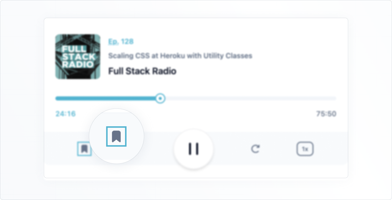
We'll create a custom Button component that uses the focusVisible state from the MUI Base ButtonUnstyled to apply a cyan ring around it.
This is what it'll look like:

Create a Button.tsx file and copy the following code:
Button.tsx
import * as React from 'react';
import ButtonUnstyled, {
  ButtonUnstyledOwnerState,
  ButtonUnstyledProps,
} from '@mui/base/ButtonUnstyled';

const Button = React.forwardRef(function Button(
  props: ButtonUnstyledProps,
  ref: React.ForwardedRef<HTMLButtonElement>,
) {
  return (
    <ButtonUnstyled
      {...props}
      slotProps={{
        root: (state: ButtonUnstyledOwnerState) => ({
          className: `hover:text-cyan-500 transition-colors ${
            state.focusVisible ? 'outline-0 ring-2 ring-cyan-500' : ''
          }`,
        }),
      }}
      ref={ref}
    />
  );
});

export default Button;
Note that we're using a callback for the root element inside slotProps.
This allows us to conditionally apply utility classes if focusVisible is true.
Now, let's replace all buttons in the initial markup with the new custom Button component.
Player.tsx
--- a/src/Player.tsx
+++ b/src/Player.tsx
@@ -1,4 +1,5 @@
 import * as React from 'react';
+import Button from './Button';
 import Slider from './Slider';

 const Player = React.forwardRef(function Player(props: { className?: string }, ref: React.ForwardedRef<HTMLDivElement>) {
@@ -32,46 +33,46 @@ const Player = React.forwardRef(function Player(props: { className?: string }, r
       </div>
       <div className="bg-slate-50 text-slate-500 dark:bg-slate-600 dark:text-slate-200 rounded-b-xl flex items-center">         <div className="flex-auto flex items-center justify-evenly">
-          <button type="button" aria-label="Add to favorites">
+          <Button aria-label="Add to favorites">
             <svg width="24" height="24">
               <path d="M7 6.931C7 5.865 7.853 5 8.905 5h6.19C16.147 5 17 5.865 17 6.931V19l-5-4-5 4V6.931Z" fill="currentColor" stroke="currentColor" strokeWidth="2" strokeLinecap="round" strokeLinejoin="round" />
             </svg>
-          </button>
-          <button type="button" className="hidden sm:block lg:hidden xl:block" aria-label="Previous">
+          </Button>
+          <Button className="hidden sm:block lg:hidden xl:block" aria-label="Previous">
             <svg width="24" height="24" fill="none">
               <path d="m10 12 8-6v12l-8-6Z" fill="currentColor" stroke="currentColor" strokeWidth="2" strokeLinecap="round" strokeLinejoin="round" />
               <path d="M6 6v12" stroke="currentColor" strokeWidth="2" strokeLinecap="round" strokeLinejoin="round" />
             </svg>
-          </button>
-          <button type="button" aria-label="Rewind 10 seconds">
+          </Button>
+          <Button aria-label="Rewind 10 seconds">
             <svg width="24" height="24" fill="none">
               <path d="M6.492 16.95c2.861 2.733 7.5 2.733 10.362 0 2.861-2.734 2.861-7.166 0-9.9-2.862-2.733-7.501-2.733-10.362 0A7.096 7.096 0 0 0 5.5 8.226" stroke="currentColor" strokeWidth="2" strokeLinecap="round" strokeLinejoin="round" />
               <path d="M5 5v3.111c0 .491.398.889.889.889H9" stroke="currentColor" strokeWidth="2" strokeLinecap="round" strokeLinejoin="round" />
             </svg>
-          </button>
+          </Button>
         </div>
-        <button type="button" className="bg-white text-slate-900 dark:bg-slate-100 dark:text-slate-700 flex-none -my-2 mx-auto w-20 h-20 rounded-full ring-1 ring-slate-900/5 shadow-md flex items-center justify-center" aria-label="Pause">
+        <Button className="bg-white text-slate-900 dark:bg-slate-100 dark:text-slate-700 flex-none -my-2 mx-auto w-20 h-20 rounded-full border-2 border-slate-900/5 shadow-md flex items-center justify-center" aria-label="Pause">
           <svg width="30" height="32" fill="currentColor">
             <rect x="6" y="4" width="4" height="24" rx="2" />
             <rect x="20" y="4" width="4" height="24" rx="2" />
           </svg>
-        </button>
+        </Button>
         <div className="flex-auto flex items-center justify-evenly">
-          <button type="button" aria-label="Skip 10 seconds">
+          <Button aria-label="Skip 10 seconds">
             <svg width="24" height="24" fill="none">
               <path d="M17.509 16.95c-2.862 2.733-7.501 2.733-10.363 0-2.861-2.734-2.861-7.166 0-9.9 2.862-2.733 7.501-2.733 10.363 0 .38.365.711.759.991 1.176" stroke="currentColor" strokeWidth="2" strokeLinecap="round" strokeLinejoin="round" />
               <path d="M19 5v3.111c0 .491-.398.889-.889.889H15" stroke="currentColor" strokeWidth="2" strokeLinecap="round" strokeLinejoin="round" />
             </svg>
-          </button>
-          <button type="button" className="hidden sm:block lg:hidden xl:block" aria-label="Next">
+          </Button>
+          <Button className="hidden sm:block lg:hidden xl:block" aria-label="Next">
             <svg width="24" height="24" fill="none">
               <path d="M14 12 6 6v12l8-6Z" fill="currentColor" stroke="currentColor" strokeWidth="2" strokeLinecap="round" strokeLinejoin="round" />
               <path d="M18 6v12" stroke="currentColor" strokeWidth="2" strokeLinecap="round" strokeLinejoin="round" />
             </svg>
-          </button>
-          <button type="button" className="rounded-lg text-xs leading-6 font-semibold px-2 ring-2 ring-inset ring-slate-500 text-slate-500 dark:text-slate-100 dark:ring-0 dark:bg-slate-500">
+          </Button>
+          <Button className="rounded-lg text-xs leading-6 font-semibold px-2 border-2 border-slate-500 text-slate-500 dark:text-slate-100 dark:ring-0 dark:bg-slate-500 hover:ring-cyan-500">
             1x
-          </button>
+          </Button>
         </div>
       </div>
     </div>
Some classes were slightly changed on some buttons so we have a consistent focus indicator.
What we learned
These are the things we covered in this guide:
✅ How to use Tailwind CSS utility classes to style MUI Base components, using the slotProps prop for targeting specific slots within the component.
✅ How to create custom components for specific slots in more complex customization scenarios.
We used the component prop to pass them into the parent component.
✅ How to apply conditional styling based on the owner component's state using a callback as value for the slotProps prop.
Get all the code used in this guide in the MUI Base with Tailwind CSS example project.